Have you ever felt that your landscape photography is missing a little punch? You look at other photographers’ images and their colours have a very appealing amount of contrast. But no matter how much you play around with HSL (Hue, Saturation, Luminance), Contrast, Vibrance or Saturation, your colours just don’t get the same depth and contrast and end up looking fake and oversaturated.
The quality of the lens being used affects color greatly (more expensive lenses generally give a much better colour contrast than entry-level lenses). But there is a step that you can do when post-processing your recent landscape photos to give the colours an extra little bit of punch and contrast and more importantly, keep them from looking overcooked.

Color space
You may be aware of a term Colour space which essentially determines how devices represent colour. The two most common colour spaces are Adobe RGB and sRGB. Adobe sRGB is used on the web and for many smart devices. Adobe RGB is a little bigger than sRGB and can show more colors. However, these are not the only colour spaces around. Lightroom, for example, uses one of the largest (able to produce a larger amount of colours) called ProPhoto RGB.
But enough about colour spaces! I can already see your eyes glazing over, mine are already as I type this. But knowing that there are different colour spaces can be helpful. Knowing exactly how they work isn’t necessarily all that important.
Convert to Lab Color
The colour space that you’ll want to recognize is LAB Color. How does it work? Doesn’t really matter. But how can you use it give your images that extra punch? In this article, I’ll explain how a very simple step (and I mean simple!) that will help give your images that extra punch using the LAB colour space in Photoshop.
Okay, so first up you’re going to want to bring your image into Photoshop. Before you do this, you may need to develop the image a little in Adobe Camera Raw or Lightroom. Fix up any exposure issues, correct the white balance, etc.
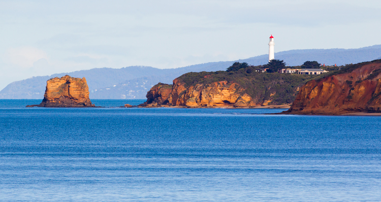
This is the image that I’ll use as an example.
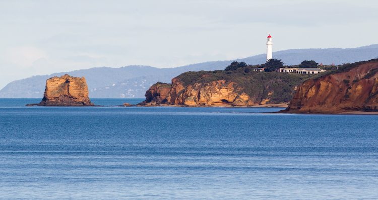
This image has had very little done to it prior to Photoshop. A simple crop, general contrast and exposure correction were all that was applied.
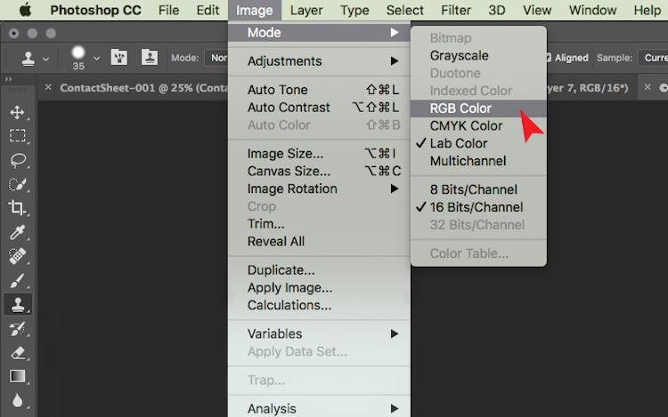
Now that your images is open in Photoshop, the very first thing you need to do is convert it from Adobe RGB or sRGB (depending on what you have set as the working colour space in Photoshop) to LAB Color.
To do this, go to: Image > Mode > Lab Color.
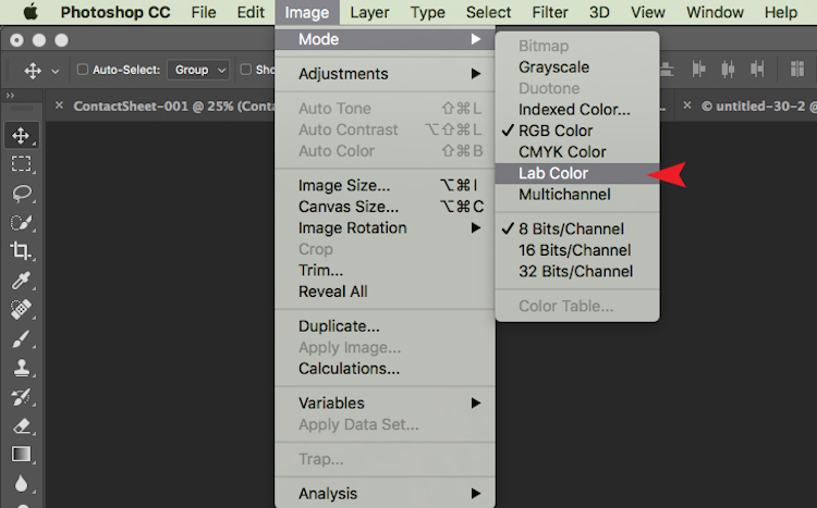
The tick next to RGB Color means that Adobe RGB is currently being used.
Now Photoshop is using LAB instead. You won’t notice a change at all at this step because nothing has changed on your end. All you have simply done is tell Photoshop which method to use to display colours.
Add a Curves Adjustment Layer
With your image in LAB Color, the next step is to create a Curves Adjustment Layer. Once this layer has been created, you should see something like this:
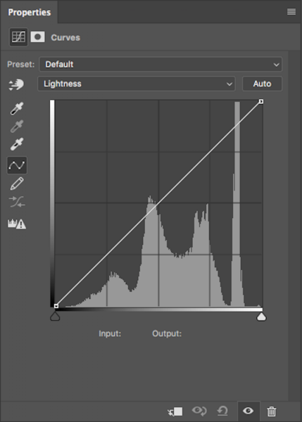
Generally, this doesn’t look any different to any other Curves Adjustment Layer except for one thing. Instead of having RGB in the drop down menu, you will see Lightness.
With this adjustment layer created, the next step is to click on the Lightness drop down menu. This brings up Lightness, A, B; which is what LAB is short for!
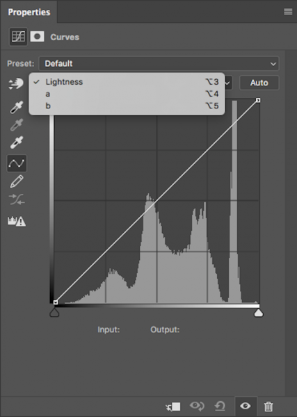
Adjust Channel A
Now, you need to select the A-channel. With the A-channel selected, bring in the shadows anchor point at the bottom-left corner toward the bottom-centre. You will notice the Input numbers increasing from -128. As a starting point, I like to bring this value to -100. Now, find the highlight anchor point (top-right) and bring that toward the top-centre by the same value; for -100 set it to 100.
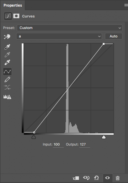
Notice the anchor points have moved toward the centre equally?
You’ll notice strange things happening to your colours as you slide the anchor points along. Don’t panic – this is supposed to happen.
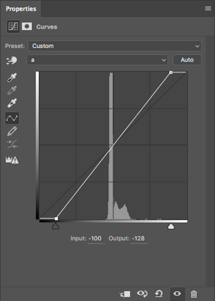
Adjust Channel B
Now do the same steps by the same values for both shadows and highlights for the B-channel.
Same steps have been done for Channel B
NOTE: make sure your Output value remains at -128 for the shadows and 127 for the highlights. If these numbers are altered it means that the anchor point is being lifted from the bottom for shadows and dropped from the top for highlights. You just want to drag the sliders along horizontally (not move them up or down).
With both A and B channels having been done now, the colour and colour contrast of your image should look different from the original. This is how my original image looks after these steps.
This is after setting A/B shadows to -100 and highlights to 100.
Fine tuning
For me, that is looking a little overdone. But no problem! To change this, all you have to do is reduce the amount you moved the anchor points in both A and B channels. I generally find going by increments of 10 is most helpful.
If you feel your image needs more punch, then you will want to bring the anchor points closer to the centre. Just remember to keep each value across the shadow/highlight, A/B channels the same.
After increasing the numbers in my images, I felt that -110/110 in A/B worked the best (see below).

Convert back to RBG
Once you are happy with how your image looks, it’s time to change it back to RGB. To change your image from LAB to RGB, go to: Image > Mode > RGB color.
You’ll be alerted that changing modes will discard adjustment layers, but that is fine. Select OK and you’ll be brought back into RGB. You’ll notice that the Curves Adjustment layer is now gone and that your image is now the background layer. However, the effect on the colours should remain. Now you’re free to go about editing the photo as much as you like.
So that’s a very simple technique to add more colour punch in your images. Just remember these two points:
- This is something that you should do at the beginning of editing your image in Photoshop and not the end as you will lose all your adjustment layers when changing modes.
- Remember to alter the anchors points from A/B b by the same value to eliminate strange things happening to your colours.
The post How to Give Your Landscape Photos Extra Punch in One Easy Step by Daniel Smith appeared first on Digital Photography School.