Contrast is one of the most important aspects that makes an image stand out. It defines structure and adds a sense of depth to an image to make it pop. In this elaborate video, photographer Mark Denney discusses five different ways you can enhance contrast in your landscape photos using Lightroom:
When editing your photos, tweaking the contrast affects a lot of variables in your photos. Besides contrast, it affects the exposure, highlights, white point, black point, shadows, color, and possibly other things too.
“I could not find one other single item that affected as many different things as contrast did. Maybe contrast really is king.”
1. Contrast Slider
The contrast slider is the most basic approach to adjusting contrast in Lightroom. You can find the contrast slider in the Basic panel. Sliding it to the left removes contrast from the image. And if you need to add contrast, simply slide it to the right.
“The way it works is it darkens down the darker mid-tones of your image and it also lightens the lighter mid-tones.”
If you remove all the contrast from an image, the histogram contracts. And, when you add contrast, the histogram spreads out.
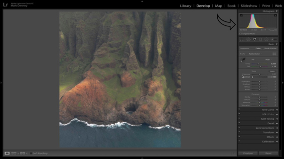
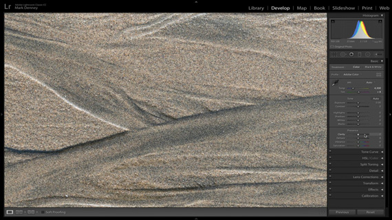
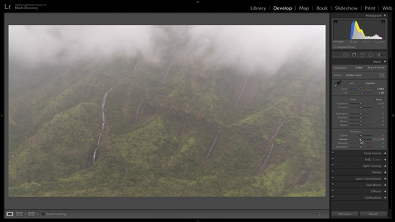
Image without much contrast
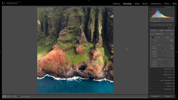
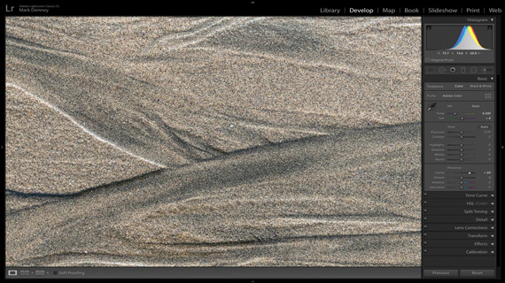
Contrast added using contrast slider
2. Black Point
This method works particularly well if the image you’re working with has a good amount of black tones. You can find the black point slider in the Tone panel of Lightroom. If you slide it to the right, the blacks will appear lighter. Sliding it to the left will make the blacks appear darker.
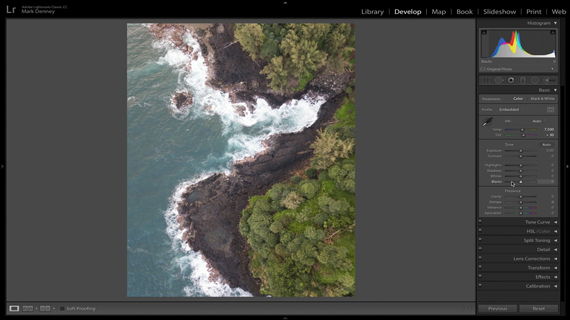
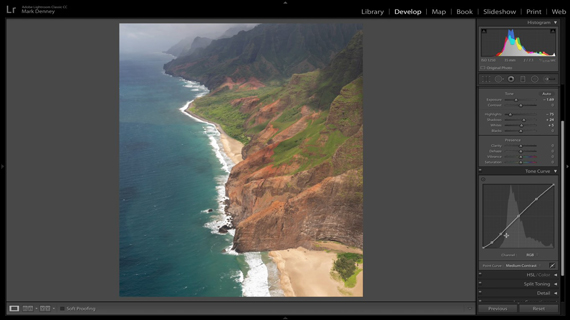
Image without much contrast
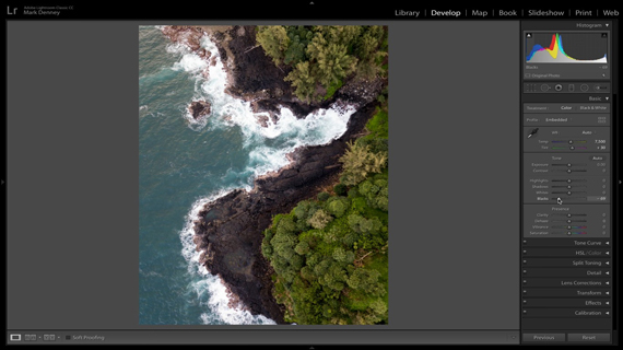
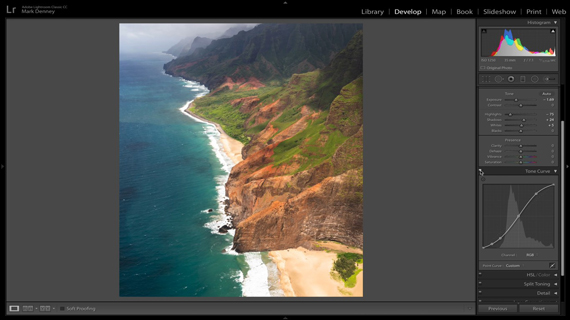
Contrast added using black point slider
The basic idea is to slide the black point slider to the left to add contrast. Play around with the slider to add the amount of contrast that’s needed. This is another quick method of adding contrast to your image.
3. Clarity
The clarity adjustment tool is a fantastic way to add contrast to an image. This tool works by looking for edges in your image. For Lightroom, a shift from darker to brighter pixels represents an edge. So, when you slide the clarity slider to the right (increase clarity), Lightroom brightens the brighter pixel and darkens the darker pixel. This gives an illusion of additional clarity, detail, and sharpness.
Notice the difference in granularity after adding clarity
“Using the clarity slider is a great way to add very localized contrast to the edges of your photograph, but as with anything, you definitely want to be careful with the clarity slider.”
Going overboard with the clarity slider introduces artifacts like halo effects. So, be sure to keep an eye out to ensure that you’re not going too far.
On the contrary, if you want to make your images softer, you can reduce the clarity by sliding it to the left. This can come in handy if you want to make skin appear softer. For landscapes, you can still reduce the clarity on some images to give an ethereal or a painterly look.
4. Dehaze
While most users don’t think of the dehaze tool as a means of adding contrast, it is indeed an interesting way to do so. Just like with the clarity tool, you don’t want to tweak it too much, but it gets the job of adding contrast done.
Haze is quite common in landscape photos, and if you turn the dehaze slider up, you can see that Lightroom almost cuts right through the haze. And in the process, the image becomes a lot punchier and contrasty.
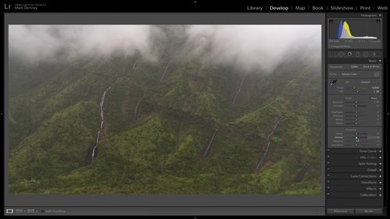
Using the dehaze tool to cut through the haze
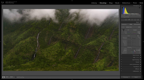
Adding more haze using the dehaze tool
5. Tone Curve
Using the tone curve is the most powerful way to add contrast to your image. This also gives you more control over where and how much contrast you want to add or remove.
If you look at the tone curve panel, there are a few things that you should understand at first.
- You have the darkest values across the bottom.
- The brightest values are represented across the top.
- The anchor point at the bottom-left corner represents pure black.
- And the anchor point at the top-right corner represents pure white.
- If you take the pure white anchor point down toward the bottom, you’ll see that then entire image turns black.
- Similarly, if you take the pure black anchor point up to the top, the entire image turns white.
If you want the tone curve to affect only a certain color tone, simply grab the color picker and click on that particular color tone. You’ll notice that an anchor point will show up in the tone curve that corresponds to the tonal value of the color that you’ve picked. Then, without releasing the mouse button, if you drag the color picker down, you’ll notice that the area you picked will go dark. And if you drag it up, the area will appear brighter.
When working with images in Lightroom, you can even use the presets that it offers to get a good starting point. A medium contrast preset introduces a subtle S-curve to the tone curve while using a strong contrast preset makes the S-curve more prominent.
Subtle S-curve using medium contrast preset
More defined S-curve using strong contrast preset
Another way to work with the tone curve is to place anchor points directly on the tone curve. Start by placing an anchor point on the center of the tone curve. Then, place another anchor point mid-way between the center point and the black point, and center point and the white point. You can pull the anchor point that’s on the right closer to the top to increase the highlights a bit. You can then pull the anchor point on the left closer to the bottom to make the darker tones darker. This will again form an S-curve which will add in a good amount of contrast in the image.

Adding contrast using S-tone curve
“The name of the game with the tone curve, honestly, is subtlety. You can very easily go overboard.”
Go to full article: Landscape Photography: 5 Ways to Enhance Contrast
What are your thoughts on this article? Join the discussion on Facebook
PictureCorrect subscribers can also learn more today with our #1 bestseller: The Photography Tutorial eBook
The post Landscape Photography: 5 Ways to Enhance Contrast appeared first on PictureCorrect.